Snifff: a deeper read of India's beauty labels
How Megha and I turned an idea about beauty-product transparency into a contextual, user-controlled Chrome extension over two months of evenings, weekends and time off.
TL;DR
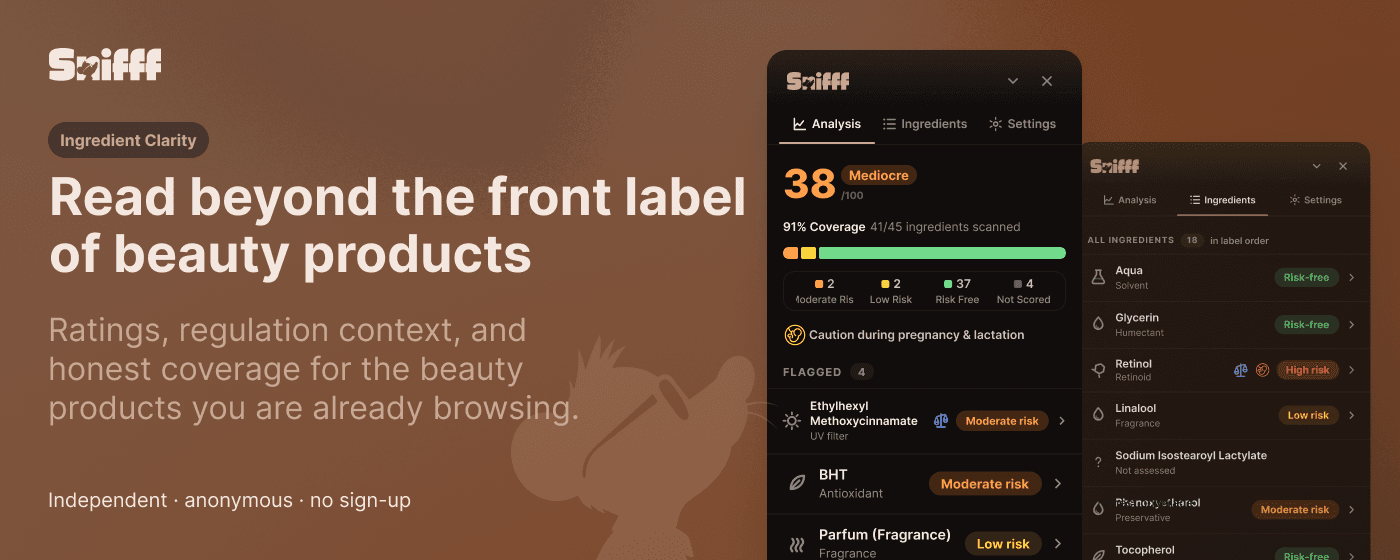
Beauty products are full of confident claims, but the ingredient label is usually left for shoppers to decode. Snifff was built to make that label more useful: not a flat good-or-bad verdict, but a clearer read of how the product changes with context.
The same ingredient can be treated differently in a product that stays on the skin versus one that is rinsed off. Concentration, audience and regulatory context matter too. The product brings those layers into the page where the purchase is already happening.
Megha led the ingredient research, safety work and master data. I led the product direction, interaction and visual design, Supabase architecture, Chrome extension, frontend and release work. We focused the beta on Nykaa, then let real pages and real edge cases shape what came next.
- Evenings, weekends and time off
- 2 months
- Human-reviewed ingredients in beta
- 1,700+
- Real Nykaa PDPs QA'd across the project
- 500+
Evenings, weekends and time off
Human-reviewed ingredients in beta
Real Nykaa PDPs QA'd across the project
- Product
- Independent ingredient-reading tool for Indian beauty shopping
- Team
- Megha Singh and Thilak Bhat
- Timeline
- Two months · nights, weekends and time off
- Beta retailer
- Nykaa
- My role
- Product direction, UX and visual design, architecture, Supabase infrastructure, Chrome MV3 extension, Figma/code sync, QA and release engineering
The label deserved more context
The initial idea was simple: help people understand what they are buying in a beauty market where ingredient lists, marketing claims and regulatory standards do not always line up neatly.
We wanted Snifff to educate without turning into a medical advice product or a clean-beauty blacklist. Its job was narrower and more useful: read the label, show the relevant context, explain what was found and be honest about what could not be read.
The design problem was not how to show a score. It was how to make the score useful without making it feel more certain than the label.
That distinction shaped the whole product. A product page needed a quick answer for someone comparing bottles, but also a deeper path for someone who wanted to inspect the ingredients. The interface had to support both without asking the shopper to learn the system first.
The real pages became part of the design brief
Nykaa was our beta retailer because it gives Snifff access to a large audience of Indian beauty shoppers. It also gave us a useful design constraint: the same information appeared in several shapes across the site.
Some products exposed a readable full list in a tab. Some mixed a short “Key Ingredients” pitch with the complete list. Others kept the list in page data, rendered it only after interaction, or showed it in product imagery. Variant changes could happen without a full page reload.
The response was a layered adapter rather than a growing pile of one-off selectors: find the product, identify the right ingredient source, remove prose that is not part of the label, and leave a clear fallback when the page does not provide enough to read.
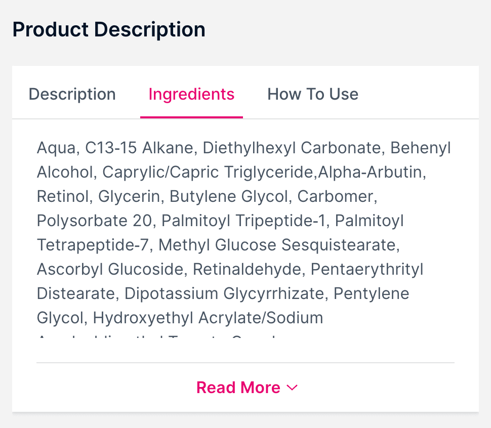
01
Readable list
The full ingredient list is visible in the page content.
Read directly
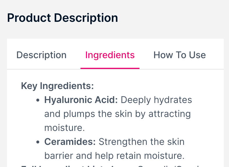
02
Mixed content
Marketing copy and the actual list share the same tab.
Select carefully
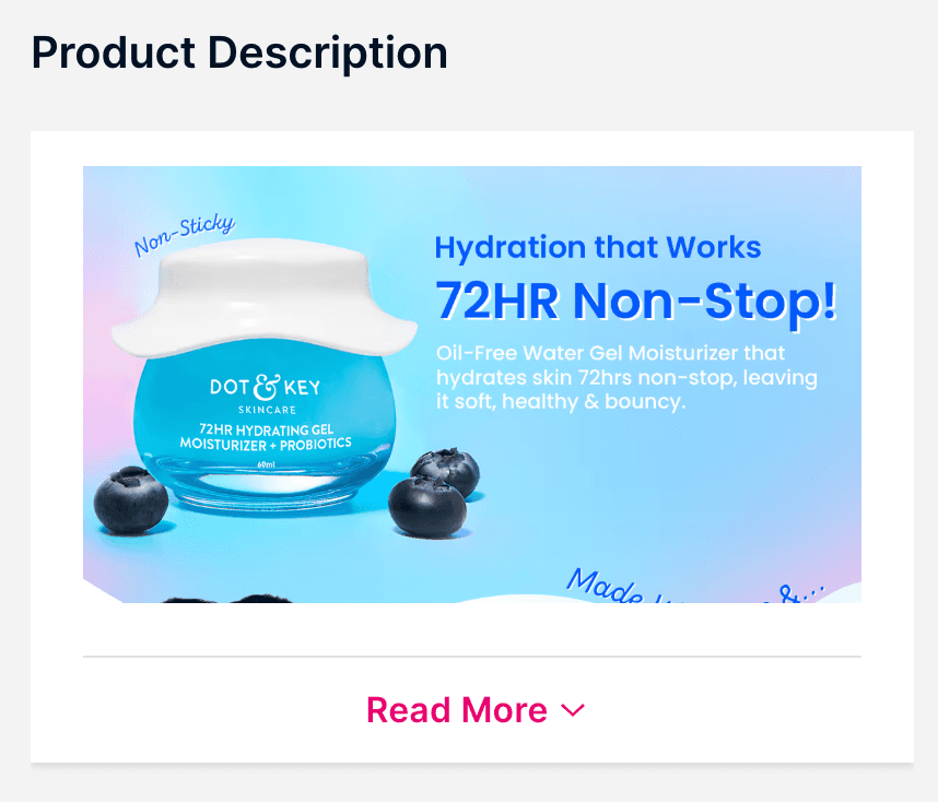
03
Image-only label
The product provides an image, not readable ingredient text.
Offer a fallback
What each version had to give up
v0.1 existed to be thrown away. The first question worth answering was whether a contextual read of a label was reliable enough to put in front of someone mid-purchase, and that answer lived in the backend—real Nykaa pages, real matching, real gaps—not in the panel. So the first interface was deliberately cheap: a score, a bar and the whole list.
It was cheap enough to be wrong in a useful way. Every version after it is easier to describe by what came out than by what went in.
From one panel to two surfaces
The first version made the analysis panel do everything. It was useful when someone actively wanted to inspect a product, but it was too much as the first thing to meet on a shopping page.
We introduced a compact score card inside the product page—below the price and close to the purchase decision. It gives the shopper a glanceable result and opens the full panel when they want to understand it.
The two surfaces share one result state. The card handles the glance; the panel handles the explanation. Inside the panel, Analysis, Ingredients and Settings separate the headline answer, the ordered label and the controls without making the first view feel like a dashboard.
Prove the read is worth trusting
The bet
A score, a coverage bar and the whole label in one panel — the least interface that could still tell us whether the analysis behind it was any good.
What it exposed
The 91% coverage bar sat directly under a 38/100. The most prominent thing in the panel was a nearly-full green bar on a product we had just called mediocre.
Give score, coverage and risk their own objects
The bet
A /100 with a rating chip, coverage as its own pill, a red-to-green gauge for the score, and the four flagged ingredients pulled above the thirty-seven that were fine.
What it exposed
The gauge implied a precision the data did not have, and coverage picked up an asterisk — which is where uncertainty goes to be ignored. The foot of the panel grew into three rows competing for the same tap.
Make the number show its work
The bet
The gauge is gone. The bar now shows composition — 2 moderate, 2 low, 37 risk-free, 4 not scored — so the score reads as a summary of something visible rather than a verdict handed down.
What it settled
Three rows at the foot of the panel became one door into the full label, in label order. Four tabs became three. The panel got shorter as the product got more capable.
The gauge was the best-looking thing in v0.3 and the first thing we cut. It made an estimate look like a measurement.
Cutting it gave us a rule the rest of the panel could be checked against: if a control implies more precision than the data behind it has, the control is the bug. That rule is why coverage in v0.4 is a stated number on the same line as the count instead of an asterisk at the foot of the panel, and why the four ingredients we could not score got their own grey segment in the bar rather than a disclaimer under it. Uncertainty stopped being a caveat and became a quantity.
Light
Dark
Once the backend and core flow were reliable, we tested the product with friends. They understood the result, but still wanted to know what Snifff was doing and how to use it. That feedback led to a short onboarding flow that explains the score, coverage and the path from the in-page card to the full analysis.
Control became part of trust
A product that reads the page should not become another thing the shopper has to manage. We changed the default behaviour from an unavoidable panel to a calmer in-page card with an optional click-to-open panel.
Settings make that choice reversible: open the panel automatically or only on click, show or hide the in-page card, follow the system theme or choose light/dark, replay onboarding, and paste a list manually when the retailer only provides an image.
Settings
The shopper decides how much Snifff is present.
Every control on this screen changes what the extension does on the page — whether the panel opens itself, whether the card shows up at all, which theme it follows. None of them change what the analysis says.
The more capable the extension became, the more important it was to make its presence optional.
We also kept the product vocabulary simple. Pregnancy and lactation information stays visible as part of the analysis rather than becoming a growing set of modes for different audiences. The product can carry more context without turning the settings page into a taxonomy.
The architecture kept the experience focused
The extension is deliberately thin. It knows how to read a Nykaa page, send the product context, and render the response. The private analysis service owns the matching, contextual resolution, score and anonymous telemetry.
That separation let the same result drive both UI surfaces. It also meant the product could improve its data and analysis without turning the public extension bundle into a copy of the system behind it.
Nykaa page
Read the label Render the result
Thin extension
Adapter + UI No private data
Private service
Contextual analysis Versioned response
Data + telemetry
Human-reviewed updates Anonymous feedback
The feedback loop is equally important. A missed ingredient does not become a user-edited safety decision. Anonymous telemetry records what was missed and how many products it blocks; that work is prioritised, reviewed by a human, validated through the release pipeline and then returned to the next version of the product.
Telemetry
01
Missed name
A label contains something Snifff could not safely match.
02
Anonymous signal
The system records the miss without creating a user profile.
03
Human review
The queue is prioritised by the products it can unblock.
04
Next release
The reviewed update returns through the same validation path.
The edge cases were the product work
The biggest improvements came from cases that looked plausible in a demo. A page could expose the right words in the wrong place. A partial label could produce a number that looked complete. A variant could change while an earlier request was still finishing.
We treated each one as a product failure, not just an implementation detail, because the shopper experiences the result—not the code that produced it.
A page had the right words in the wrong place
The adapter learned to prefer the full label and drop surrounding marketing prose.
A changing variant could leave an old answer on screen
Variant identity and run ordering keep a slower previous scan from winning the race.
A partial read could look like a complete result
Coverage became visible, incomplete results became bounded, and unmatched names stayed in view.
A useful extension could still be too heavy
A small router now waits until a product page is visible before loading the full interface.
- 1
Test the product against real pages
The QA workspace pins a corpus of 100 Nykaa product pages across categories, variants, layouts and evidence types.
Read more in the next section ↗ - 2
Keep correctness independent
The release audit recomputes key outcomes separately, so a green production path cannot simply agree with itself.
- 3
Give every serious failure a name
The bugs became permanent regression tests: page parsing, variant state, incomplete coverage, image evidence and release data all gained a guard.
- 4
Make the extension cheap to keep around
A 4 kB site-wide router now waits until a product page is actually on screen before loading the heavier interface.
The bugs that mattered most did not look like crashes. They looked like reasonable answers.
An internal QA product made review faster
To test the extension against real pages, I built an internal QA product that automated the repetitive parts of reviewing a PDP. It gave us one place to compare what the page showed with what Snifff extracted and to record the cases that needed another pass.
That shortened the feedback loop. We reviewed 200 product pages in four days, found the edge cases that mattered and turned them into fixes before the next release.
The review surfaced four recurring problems: product text in the wrong place, stale results after a variant change, incomplete reads that looked complete and an extension that was too heavy. We fixed each one and kept it as a regression check for the next release.
- PDPs reviewed
- 200
- Internal QA sprint
- 4 days
- Major problems identified and resolved
- 4
PDPs reviewed
Internal QA sprint
Major problems identified and resolved
What shipped after two months
- Human-reviewed ingredients in beta
- 1,700+
- First retailer adapter
- Nykaa
- Chrome extension architecture
- MV3
- Bidirectional design workflow
- Figma ↔ code
Human-reviewed ingredients in beta
First retailer adapter
Chrome extension architecture
Bidirectional design workflow
In-page experience
Real
Compact score card embedded in the retailer page, connected to the full analysis panel.
Analysis service
Real
Private server-side analysis with a versioned data pipeline and anonymous feedback signals.
Database growth loop
Real
Unmatched names become a prioritised, human-reviewed queue rather than a user-edited safety system.
Public distribution
Real
The signed Chrome Web Store package is live and the release has passed its smoke check.
The meaningful outcome was not just a larger ingredient database. It was a product with a clearer relationship to uncertainty: it could be present without being intrusive, useful without pretending to know everything, and designed to improve as more labels were encountered.
What changed in my practice
Snifff changed how I think about product design for systems that interpret messy information. The happy path is only one part of the experience; the boundary states are where trust is earned.
I also became more deliberate about separating a product's public interface from the system that gives it depth. A small card, a deeper panel, a manual fallback and a settings screen can feel like separate features. In practice, they are one conversation about how much the user wants to know and how much control they should have over the interaction.
The best part of building with Megha was that the product could not be reduced to visual polish or backend correctness. Every decision had to make the underlying knowledge more understandable without making it seem simpler than it was.