Getting candidates onto foundit in half the time
A phone-first registration flow that asks one thing at a time, lets a resume do the typing, and shows matching jobs before the profile is done.
TL;DR
foundit’s candidate registration asked for 32 fields across six screens. Eight of them, a password included, came before we had verified a phone number. About 20,000 people reached it every day. Fewer than three in ten finished, and nearly four in ten left before we had any way to contact them.
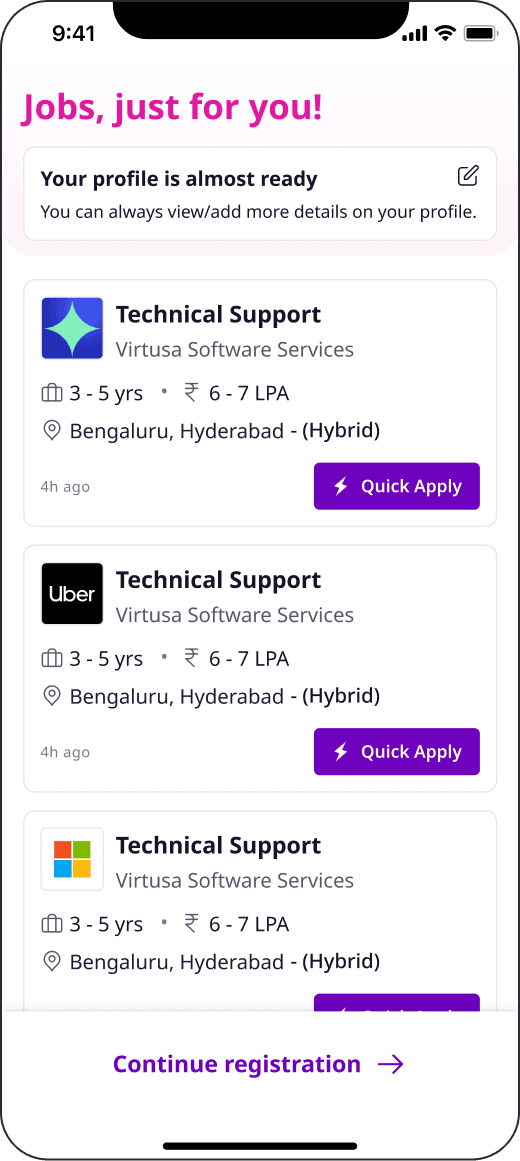
I led the research, the flow and the interface for the rebuild. The new flow verifies a phone number first, lets a resume or LinkedIn profile fill in what it can, and asks one question per screen. Matching jobs appear as soon as the basics are in, before any of the questions recruiters need.
It shipped in two releases. Phase 1 fixed the structure and went live in January 2024. Phase 2 followed in March and went all in on one field per screen, mobile layouts and polish. Registration now takes 106 seconds instead of 232, and three of the four targets were beaten. Conversion reached 39.4%, which is 0.6 points short of the 40% goal.
- Average time to register, down from 232s
- 106s
- Overall conversion, up from 28.9%
- 39.4%
- Contactable users, up from 62.4%
- 85.3%
- Resume uploads, up from 46.1%
- 62.2%
Average time to register, down from 232s
Overall conversion, up from 28.9%
Contactable users, up from 62.4%
Resume uploads, up from 46.1%
Role & scope
- Role
- Senior UX Designer. I owned the research, the flow strategy and the interface across both releases.
- Working with
- A product manager, the engineering team and data science.
- Scope
- Registration for new candidates on mobile, from the first sign-up screen to the first job recommendations and the optional profile questions after them.
- Research
- Funnel analytics, six one-to-one interviews, and a benchmark of Naukri, Indeed and Shine.
- Timeline
- Started in November 2023. Phase 1 went live in the second week of January 2024, and Phase 2 in March 2024.
1: The problem
Registration is where a visitor turns into someone foundit can match to jobs, contact and bring back. The business wanted a lot from it: more verified leads, so that people who dropped off could still be nudged to finish their profile; more resume uploads; cleaner data, in the right format and derived wherever we could; and a flow that felt like a modern job platform. The headline number was time. The goal was to halve the average registration time, to under two minutes.
The funnel showed where it was going wrong. Of everyone who landed on the registration page, this is how many were still there after each step.
The biggest drop was the first one. 37.6% of people left between the landing page and phone verification. That page asked for a name, email, password, phone number and gender, offered a resume upload and a WhatsApp toggle, and only then sent an OTP. Anyone who left there left without a verified number, so there was nobody to remind and no way to bring them back.
The rest of the flow was long in a different way. Every screen was a form, most answers were dropdowns, and the questions branched on experience, notice period and whether the candidate was in India. It took 232 seconds on average to get through.
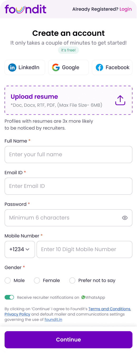
01Landing page
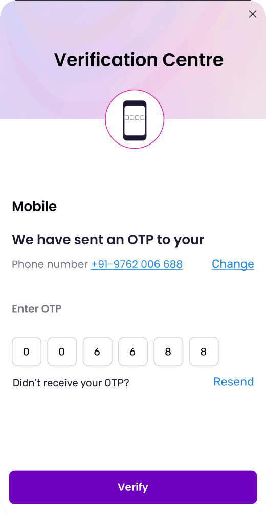
02OTP
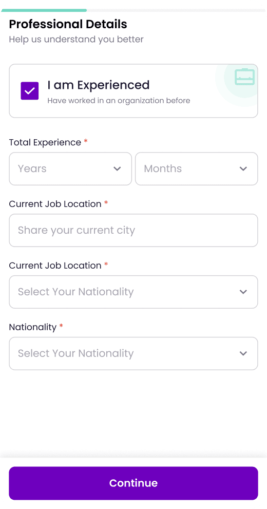
03Professional details
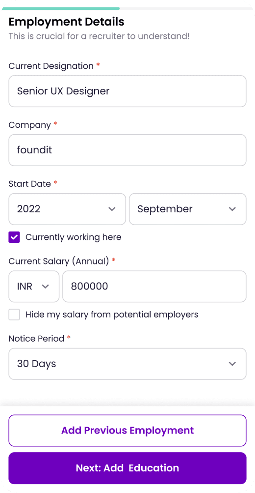
04Employment
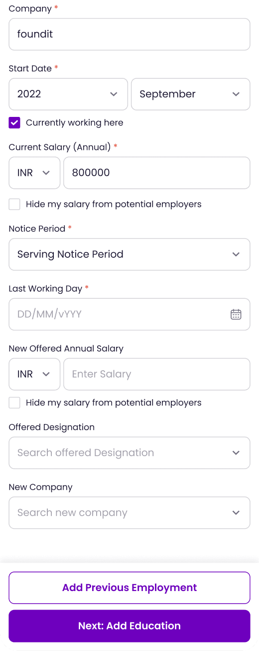
05Employment, serving notice
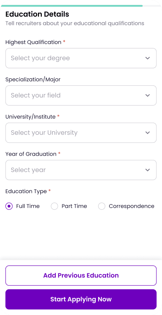
06Education
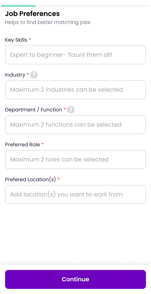
07Job preferences
2: Research
The funnel said where people left. I wanted to know why, so I spoke to six people who had registered in the previous seven days, for 30 minutes each. They ranged from freshers to someone with 15 years of experience, across Tier 1 and Tier 2 cities. We talked about how they look for jobs, which platforms they use, and what went through their heads while registering on foundit.
I also mapped where registrations start. People arrive from at least seven places, and most of them already want something specific: a job they found, a recruiter who reached out, a recommendation in an email. The old flow made all of them fill in the same form before any of that came back.
Uploading a resume saved no time
The landing page sold the resume upload hard, and people who used it expected it to do something. It didn’t. They typed the same details again on the screens that followed. One person couldn’t get the upload to work at all and never found out why.
“Even after uploading my resume I had to fill all the information again.”
Interview participant
The first page set the wrong expectation
The landing page was so long that people assumed it was the whole registration. Finishing it only to find four more screens was a letdown. Social login had the same problem: one person expected it to skip the long first page, and it didn’t.
“I had the initial impression that after the long first page I would be registered.”
Interview participant
Hard choices and dropdowns stalled people
Some questions were hard to answer at all. Preferred industry and function was the worst, with no way to say “any industry”. Dropdowns made even the easy questions slow, and one person called them irritating. Another said the page felt slow to load.
“Preferred industry and function was really hard to decide.”
Interview participant
Nobody else had solved it either
I went through registration on Naukri, Indeed and Shine. One interviewee said Naukri’s felt better but still asked for the same amount of information, and the benchmark agreed.
Two ideas were worth borrowing. Naukri used pill-based selections for most fields, which suit a phone far better than dropdowns. Shine asked for LinkedIn and used icons and illustrations that made the forms feel lighter.
3: The strategy
Three principles came out of the research, and every screen after this had to answer to them.
- 1
Contact first
Ask for a phone number and verify it before anything else. The old flow lost 37.6% of people before this point. In the new one, anyone who leaves after the first screen is still someone we can reach.
- 2
Let the resume do the work
Offer a resume or a LinkedIn profile before any manual entry, and use it to fill in the profile. Candidates should be confirming details, not retyping them.
- 3
One question at a time, and something back early
One field per screen, with honest progress. Chips, pickers and suggestions instead of dropdowns. And matching jobs as soon as we know enough to find them, not after the last question.
Before
Six long screens, most of the questions up front.
- Landing page8 fields incl. password
- OTPVerify phoneVerified lead, after 8 fields and a password
- Professional detailsExperience, location
- Latest jobUp to 10 fields
- EducationDegree, university, year
- Job preferencesIndustry, function, role
- Registered
After
One thing per screen, with something back along the way.
- Sign upPhone + email, or social
- OTPVerify phoneVerified lead, after 2 fields
- Resume or LinkedInAutofill the profile
- BasicsName, experience, location, work
- Jobs for youBefore any job details
- Job detailsSkills, salary, notice
- Profile readyApply straight away
- Super profileOptional, skippable
The field count came down with it. Offer details, previous jobs, industry and function all moved out of sign-up, and the flow went from 32 fields to 23.
4: Two releases
The plan was bigger than engineering and data science could ship in one go. When we sat down with business, product and engineering, four things pushed back.
- 1
A 20-year-old data model
The profile data structure had to be rebuilt before it could handle a flow that changes shape as you answer.
- 2
Drop-off logic
Candidates who leave halfway run through complex profile-update logic. The new flow touched all of it, and testing would take longer than estimated.
- 3
Industry to role mapping
Data science needed time to map industries to roles before we could suggest them.
- 4
LinkedIn pre-fill
LinkedIn data had to be mapped to our database fields before it could fill in anything.
So we split the work.
Phase 1: fix the structure
Phase 1 went live in the second week of January 2024, about two months after the project started. It moved the phone number and OTP to the front, brought the resume upload in straight after, and cut the fields from 32 to 23. It also changed the order for experienced candidates, asking about job preferences before education. That helped us suggest more relevant jobs sooner, and applies on those jobs went up.
- Average time, from 232s
- 155s
- Conversion, from 28.9%
- 36.7%
- Contactable, from 62.4%
- 82.3%
- Resume uploads, from 46.1%
- 57.4%
Average time, from 232s
Conversion, from 28.9%
Contactable, from 62.4%
Resume uploads, from 46.1%
Contactable users passed their target straight away. Time, conversion and resume uploads moved a long way but not far enough. Launch also showed us the limits of autofill: the resume parser filled only around 30% of fields, so candidates still typed more than we wanted. The data team began improving the parser, and LinkedIn mapping went into testing.
Phase 2: sharpen the experience
Phase 2 went live in March 2024 and took the principles further than Phase 1 could. Every question got its own screen. Layouts were rebuilt for a phone first. Matching jobs moved up to right after the basics, and the whole flow got a proper visual pass. That is the version below.
5: The final flow
The finished flow runs in three stages, and the first two end with the candidate getting something back.
Stage 1: get started
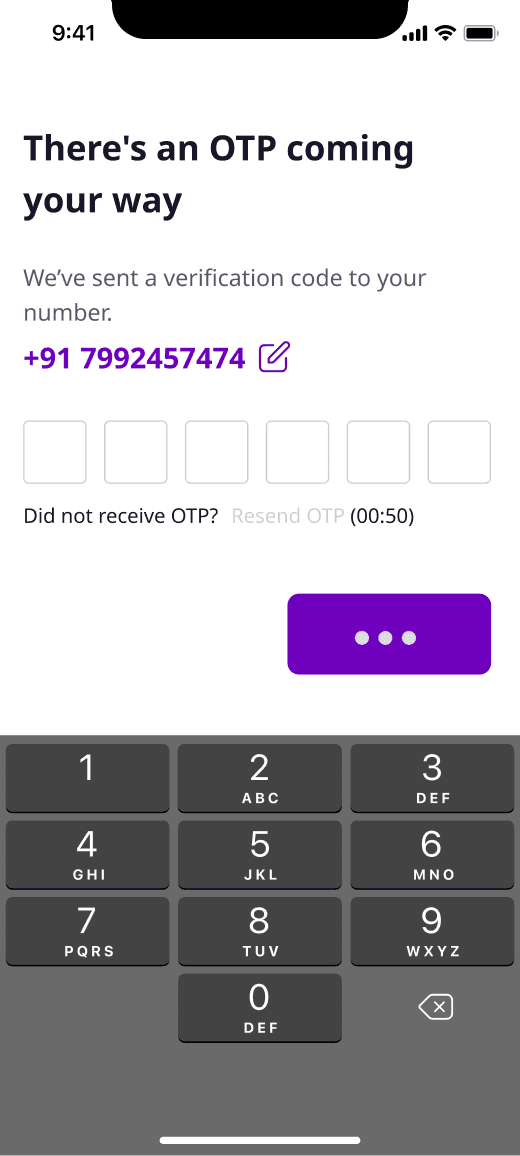
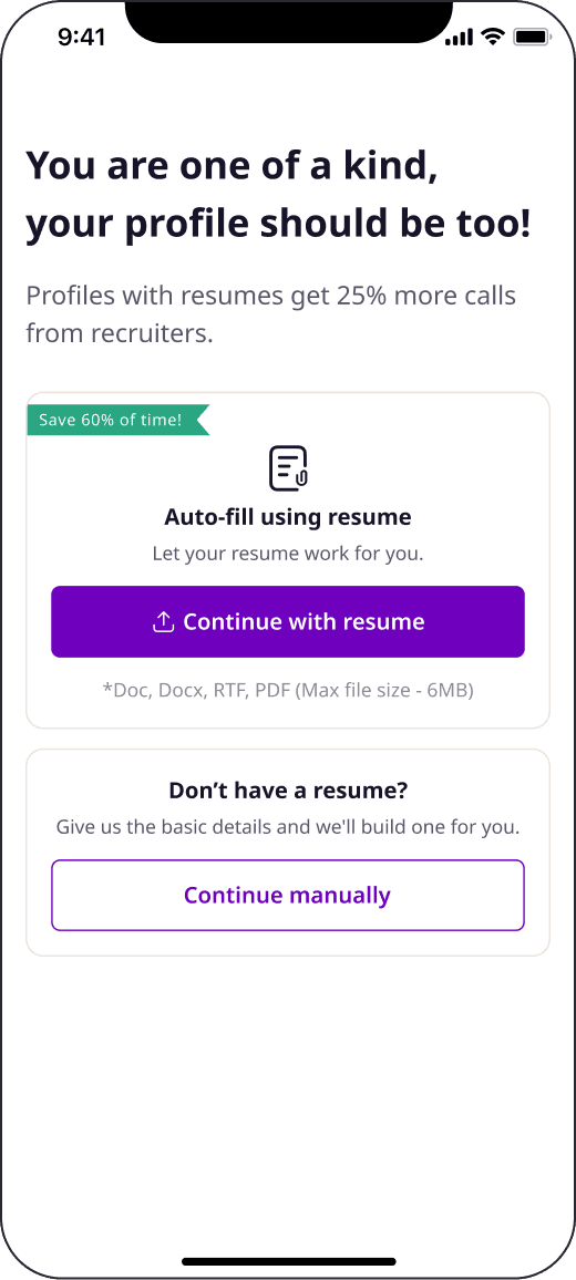
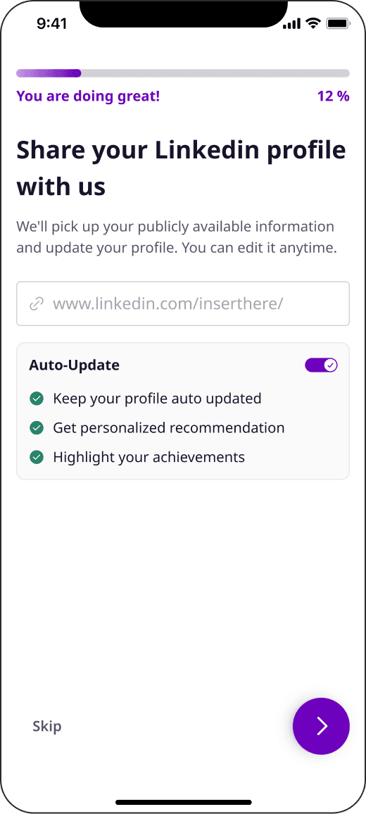
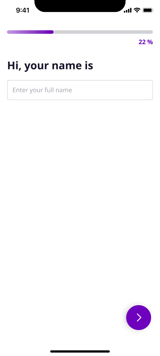
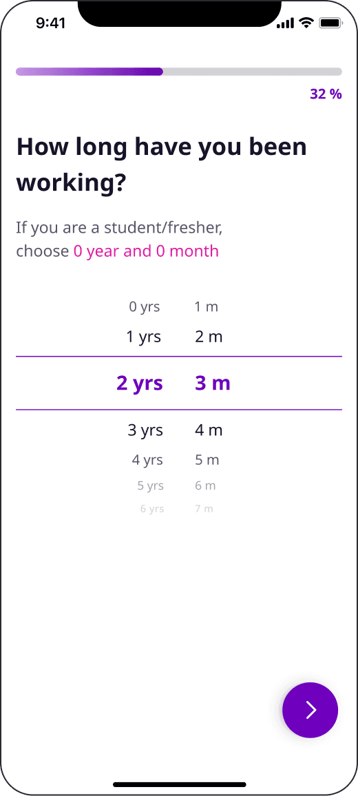
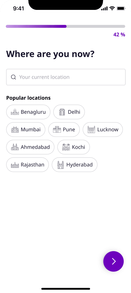
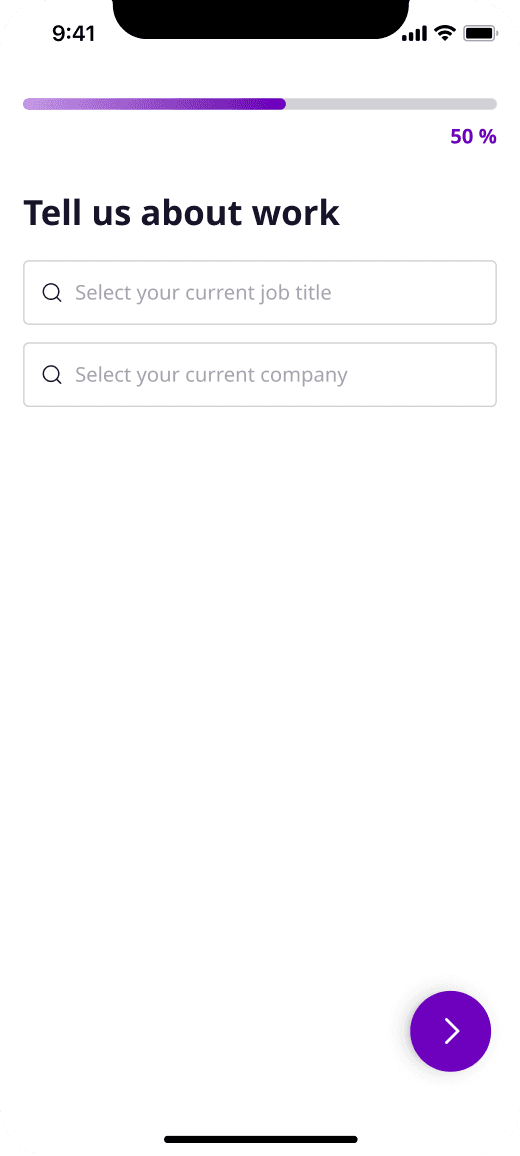
Sign up, verify, then six short steps. The resume and LinkedIn screens come first so that everything after them can be pre-filled. The progress bar moves in steps of roughly ten, from 12% on LinkedIn to 50% on work, and then the candidate lands on jobs picked for them.
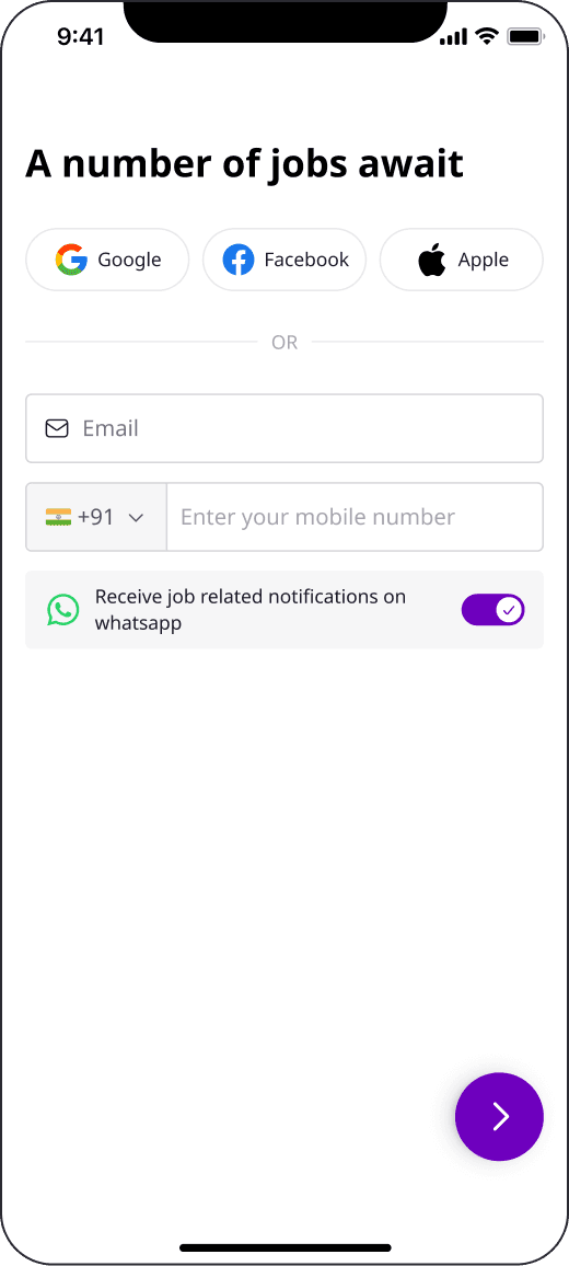
01Sign up
02OTP
03Resume
04LinkedIn
05Name
06Experience
07Location
08Work
09Jobs for you
Stage 2: what recruiters need
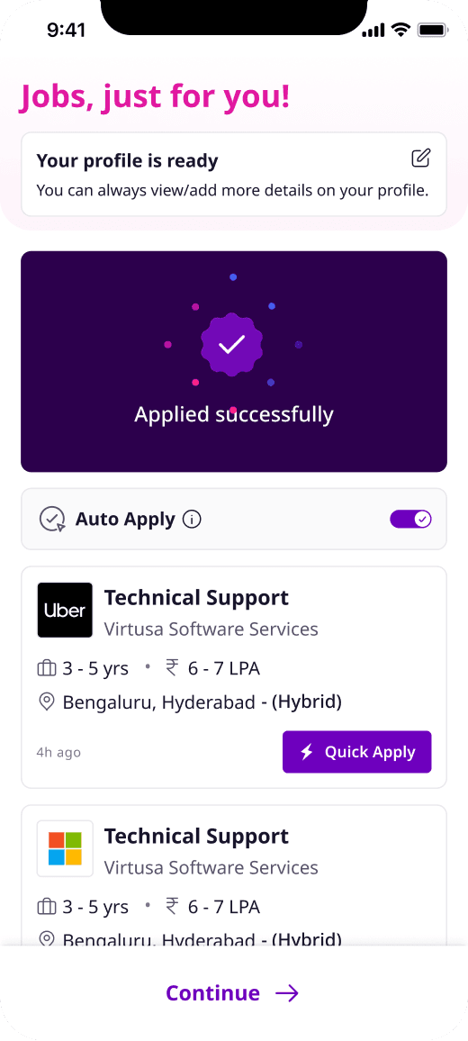
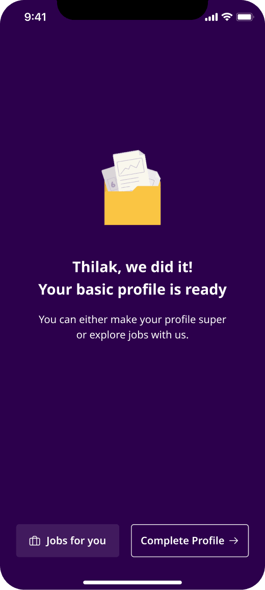
Next come the questions recruiters care about: when they joined their current company, skills, salary and notice period. Where it helps, the screen says why it is asking. Skills, for example, explains that they act as the keywords recruiters search on. Then the candidate can apply, and the basic profile is done.
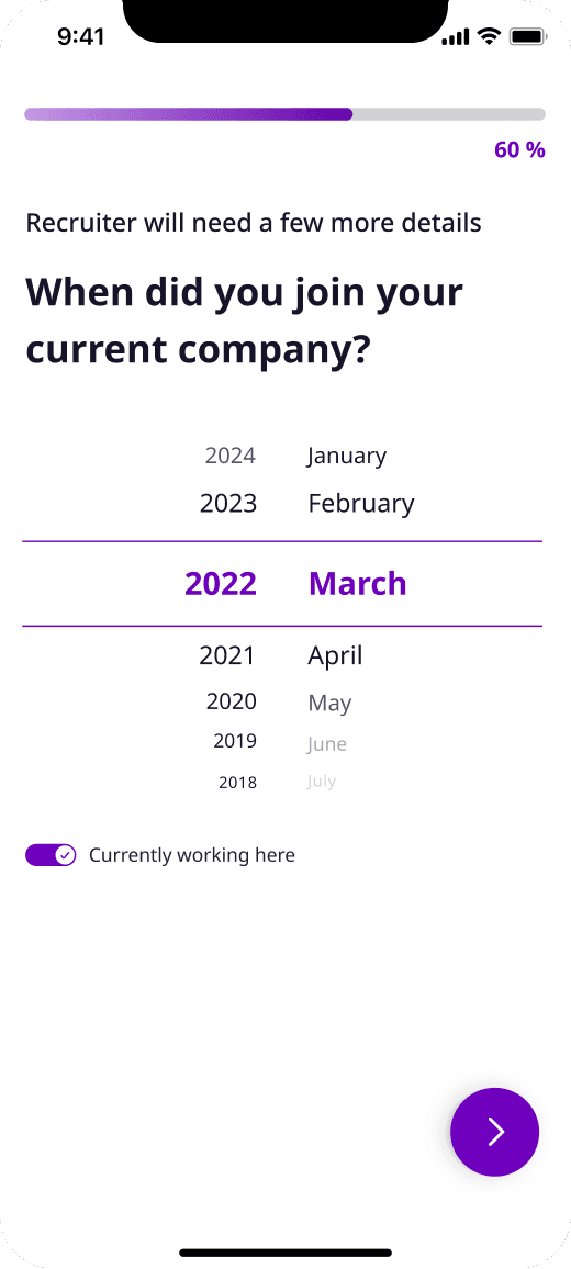
01Join date
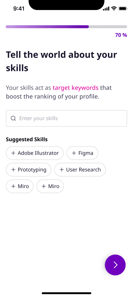
02Skills
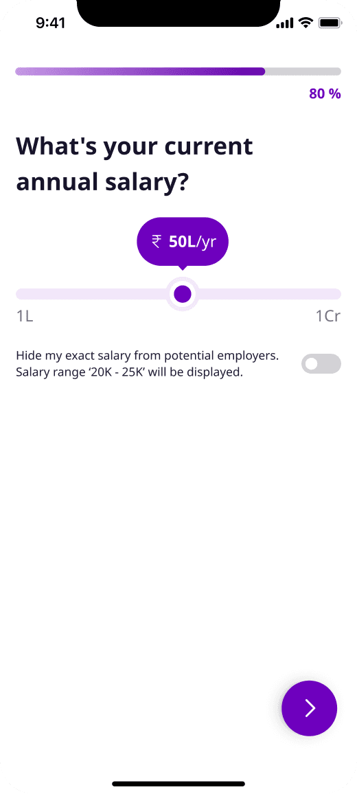
03Salary
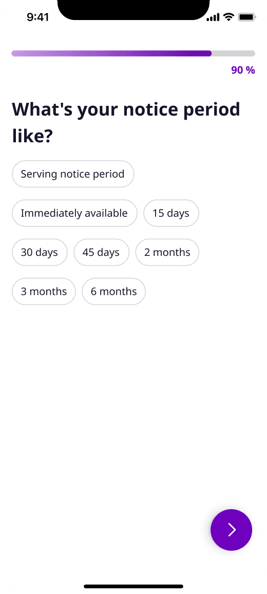
04Notice period
05Applied
06Profile ready
Stage 3: the super profile
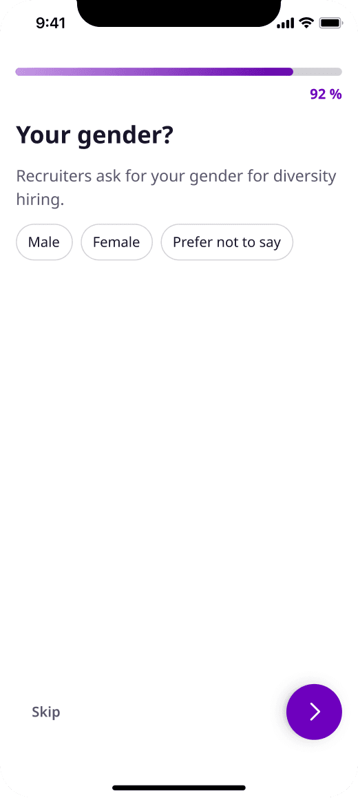
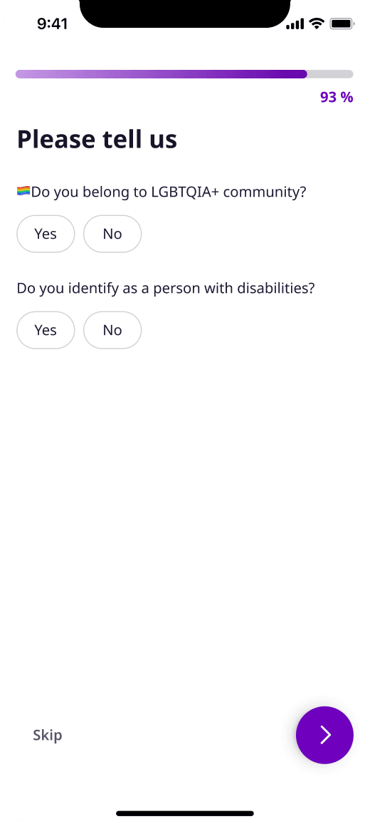
Everything after that is optional. Gender, diversity, education and preferences all sit here, and every screen has a Skip. The gender screen says plainly that recruiters ask for it for diversity hiring. The education questions use suggestions and pickers instead of the old dropdowns.
01Gender
02Diversity

03Qualification
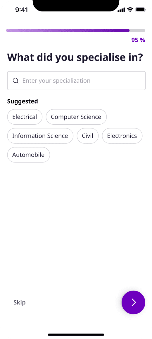
04Specialisation
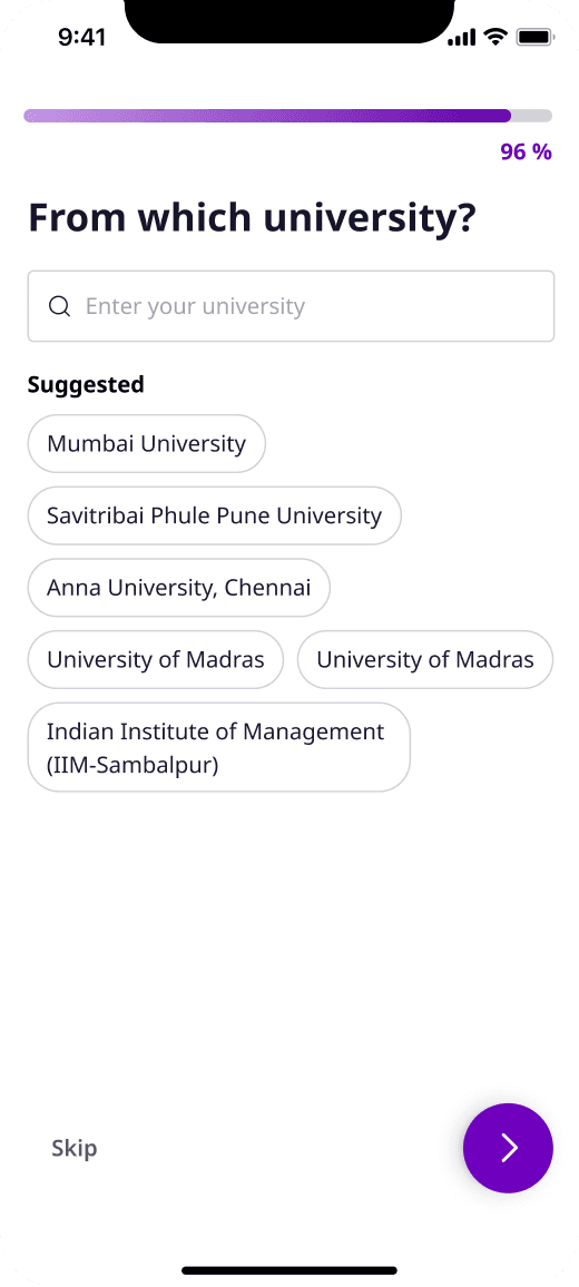
05University
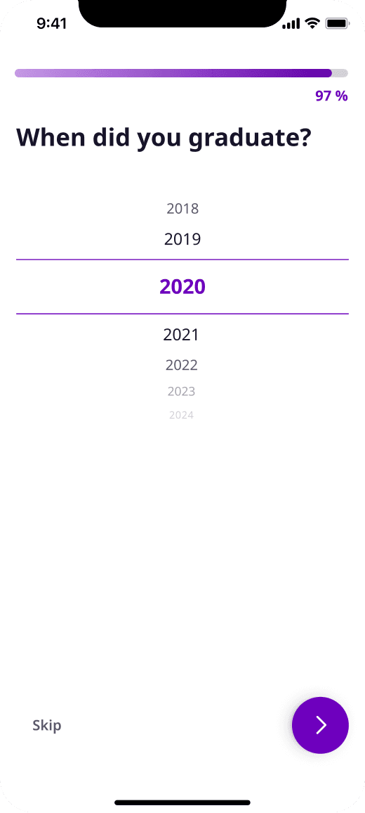
06Graduation year
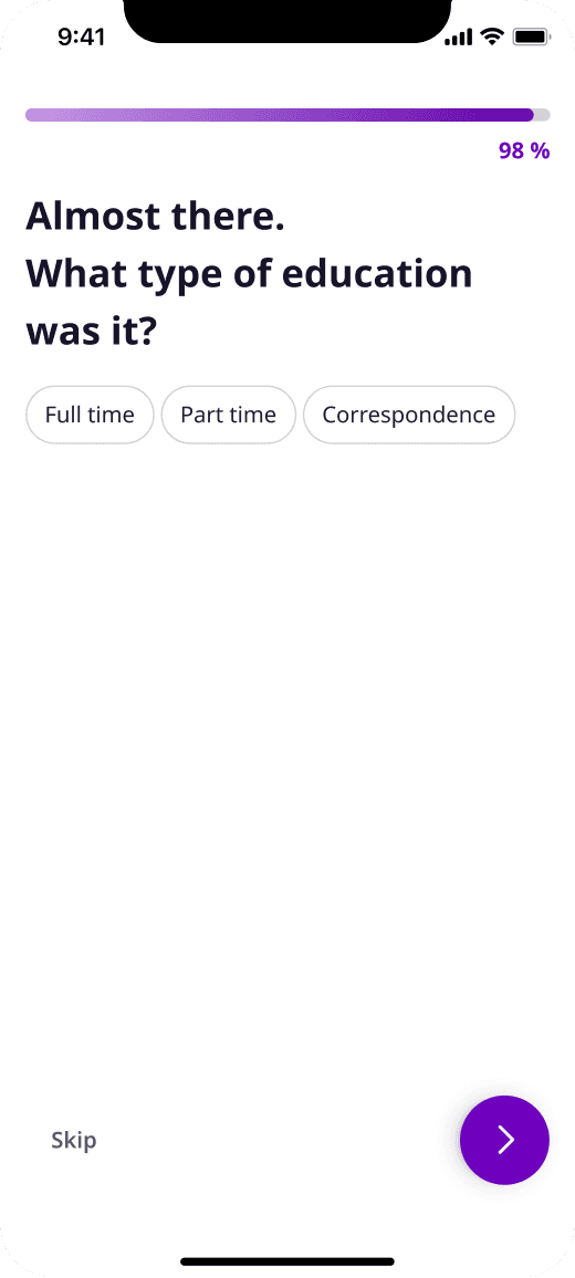
07Education type
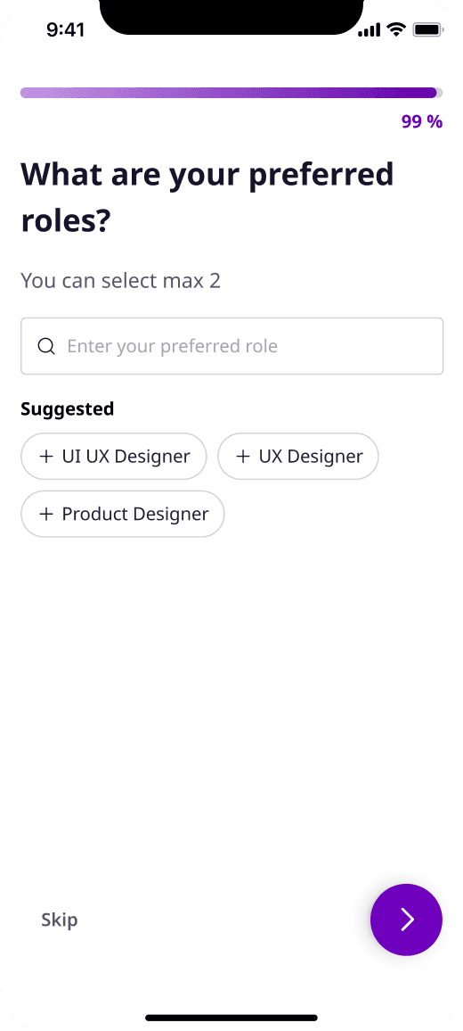
08Preferred roles
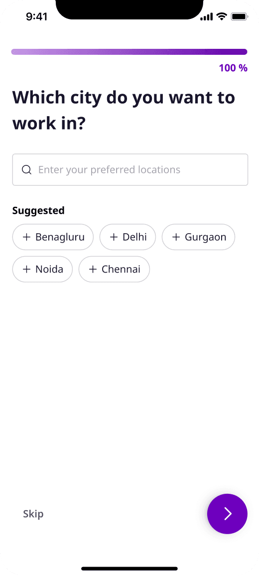
09Preferred city
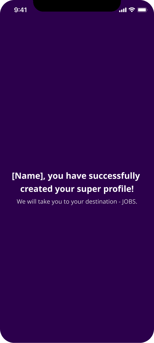
10Super profile
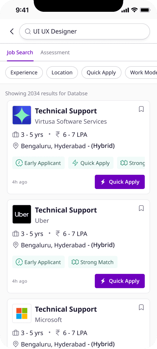
11Search results
6: Design decisions
Most of the flow follows from the three principles, but a few screens carried more of the weight than the rest.
01Phone-first sign-up
Phone and email, or one tap with Google, Facebook or Apple. No password, and the WhatsApp opt-in sits right under the number.
02Verify straight away
The OTP arrives after two fields instead of eight. From here on, a drop-off is a lead we can follow up.
03Resume first
Autofill is the recommended path. Manual entry is still there, just not the default.
04LinkedIn pre-fill
Pulls in public details and can keep the profile updated. It is skippable.
05Scroll pickers
One picker replaces the old year and month dropdowns. Freshers are told to pick zero.
06One-tap locations
Search is there, but most people only need the popular cities shown as chips.
07Private salary
A slider, with the option to hide the exact figure from employers and show a range instead.
08Apply mid-flow
Many people arrive wanting to apply to a specific job. Now they can, before the profile is finished.
7: Results
Phase 2 took registration from 232 seconds to 106, a 54% cut against a goal of 50%. Contactable users and resume uploads both cleared their targets.
Conversion is the one that fell short. It went from 28.9% to 39.4%, a 36% relative lift, and stopped 0.6 points under the target. I would rather show that than round it up.
8: Reflection
Contactability beats completeness
Moving verification to the first screen changed what a drop-off meant. Someone who left halfway was no longer lost; they were a lead with a half-finished profile we could nudge. Contactable users went from 62% to 82% in Phase 1, before any of the polish.
Ship the structure, then sharpen it
Splitting the work gave Phase 2 a working flow and real numbers to push against, and Phase 2 is where time dropped from 155 seconds to 106.
Autofill is only as good as the parser
The whole flow leans on the resume doing the typing. At Phase 1 launch the parser filled around 30% of fields, so the biggest lever left on time and data quality sits with parsing, not with the screens.